Wednesday 12 December 2012

Evaluation - Time

Here is an evalutation on my clock, where I will discuss the parts that are good and what improvements I can make next time.


This clock I have worked really hard on, and I am generally happy about the result - even after repairing the broken pieces... The cracks has changed from my initial idea of the artwork, from being slow - thinking about life, that there is still a lot of time left for us to live. That life is about loving, trusting and dreaming - to a bit faster pace where these cracks may signify thunder. Maybe that life as its upsides and downsides, and even though it is this way, we are still supposed to love, trust and dream to achieve our goals in life. This is actually the first time I have really been satisfied with my work!

What was good?
Firstly, I think that the idea is one of the best ideas I have made since I first started at MYP, It really shows who I am, and who I want to be, as I have always been into building my motivation for a better life. I think it was good that I only chose to paint three words, because if I had written one or two more, they would have been quite small. These words have an appropriate size.
Also, I like the way I have created space in front of the clock where I may want to put candles on when I bring it home. (Yes, I would like to bring it home.)
Finally, even though it is a shame that the it broke, I like the new, changed meaning of the clock and to exaggerate it a bit more, I have included darker purple on the left side and a bit lighter on the right side. It was actually not on purpose, but I still feel that it gave something a bit more to the clock.

What improvements can I make for next time?
NOT TO BREAK IT.
No.. just kidding.
I can now see on the picture that the words are slanted a little, so this is probably the first thing I would improve on. It also would be great if I could emphasize the cracks a little more, so that they really stand out. This was one of my goals last week, however because I had the whole artwork to paint, I didn't have time. In addition to this, I noticed that when we were to put the clock in on the back side, it just barely fitted and the needles almost got stuck on the surface of the front so they didn't move. We managed to fix this, but to avoid this problem in the future, I will make sure to leave enough space for the clock to fit perfectly fine.

Generally, I am pleased with my work and I feel proud to accomplish this, even after my inital idea was somewhat spoiled.
Loved this unit!!

- Anisha

Thursday 29 November 2012

Maybe everything is okay after all?

I came to the lesson today, both excited and curious to work on my product. I know that it is not how I want to be, but I am trying to take it with a positive attitude and it may work out just fine when I have finished painting. With help, I started off by puzzling the pieces together and I eventually started gluing. This actually took the whole double lesson, because they didn't want to stick together and dry (maybe because I used too much glue sometimes). Even so, I managed to glue everything together and hopefully they will stay glued until next week, which is the due date. It was actually supposed to be by the end of the lesson today, however I would simply not have the time to complete it with the give timeframe. Therefore, I am happy that we received a week's extension :). I also managed to paint the base of the clock black, but it was not very much. 

Even though there are cracks on my clock, I am not going to change my initial idea on the design and layout of my final outcome. Therefore, I will still include the motivational words, which represents slow time due to the long life we have ahead of us. Some may say that it represents fast time, because of how short life really is, although I choose to represent it as slow time. 

- Anisha

Thursday 22 November 2012

OHNOOO!!!!!

This lesson my whole artwork fell and was destroyed!!! I started of by sanding the artwork and doing the finishing touches, and then when showing it to Mr. Roman, it suddenly fell forwards and was destroyed into several different pieces! I am quite sad now, but Mr. Roman suggested that we could put it in the fireplace and then try to put it together next week.


The next couple of minutes, I just tried out colours, and I thought to make the cracks black, and a purple/violett face and light yellow letters. I think it will be successfull after all, even though I am sad about it.

- Anisha

Sunday 18 November 2012

Up till now

I haven't posted for a long time, since we have not had Art for almost 3 weeks. Last lesson I carved in the clock on the right hand side of the leather-dry clay. I also placed the face where the clock is, on top of the bottom part so that it is stable. It broke off one time, but I managed to fix it again. I just hope it doesn't happen again, since I will be sooooo angry!!

Saturday 27 October 2012

Last Lesson

I used the whole lesson on Thursday to create my clock shape out of clay. Instead of just having a rectangle with the clock on, I put it on top of another bunch of clay at the bottom for it to stand properly. Next lesson, which will not be until 15th of November, I hope the clay becomes leather-dry so I am able to drill the actual  "clock" on it. I am very happy with the outcome so far, but I do not have any pictures yet.

Sunday 21 October 2012

New Unit - TIME

Last lesson, on Thursday, we started a new unit called Time. The assignment for this unit is to create a clock which expresses some sort of time - slow or fast? Since I was not in class during this period, I was not able to sketch ideas, but during the day I thought about some ideas which I then sketched down in my book at home. I also may have some difficulties being in lesson the next couple of weeks, which may make things difficult for me.

Floyd''s snail really inspired me last year, as it really was a fantastic Art work. I would have wanted to use the same idea, but what if I can come up with something fantastic myself? 

Here are some of my ideas sketched down: 
1. An eye. I like to draw eyes so my first idea is an eye. It can show how time passes by before someone's eyes, without them knowing. It is not my final choice.

2. A leaf. I was walking down the street and suddenly a lot of leaves were falling from the tree above me. It expresses slow time, as the leaves fall down slowly and settle on the ground. I thought this could be a great idea. By finding one large piece of maple leaf, and then add a lot of smaller ones on top, I can make the clock easily. Not my final choice however.
3. A clock with motivational words. I love to read motivational quotes and words about life, and I wondered if I could do something towards this. It can express slow time, because when reading them, we settle down and think about our own life which is ahead of us - a long time until we reach what we want to reach (goal etc.). This is my final choice. I think the one to the left would look the best. I dont yet know, however, what materials to use, and what to put on the needles. Maybe two other words?


Wednesday 3 October 2012

Evaluation - Symbolic Self Portrait

I will now do an evaluation of my painting, discussing what was good, how it is linked to Frida Kahlo's technique or style, and what I can improve for next time.


What was good?
What I think was good, was how I used different symbols in my painting to represent my interests, my religion and my culture. The blue to purple shading, represents my favourite colour - purple. I think I managed to do this quite well, after demonstrations from the teacher. The "Om" signs on the other half of the background represents my religion - Hinduism. A beautiful, soft colour, with many signs on top. And the "bindi" (red dot on the forehead), and my traditional dress represents my culture - India. I have also added other symbols to the painting, such as the heart necklace (it is easy to understand what that is for) and my use of make-up, as I like to wear make-up and dress beautifully. I believe with these symbols, I am able to fully represent me, even though the image of me doesn't look the same.
Even so, there are some aspects of the painting that I like, such as my eyebrows that really defines my own eyebrows, and typical Indian ones. I also like the colours which I chose for my traditional dress (sari).


How was it linked to Frida Kahlo's paintings?


Similarly to Frida Kahlo's painting, I have placed myself in the middle of the canvas, as most other self-portraits. Frida Kahlo applies a lot of her culture and religion in her paintings, which is also something I did for my own. This is not present in this painting, although the painting below, shows a traditional dress, probably Mexican that defines her culture. Even so, what I have I have chosen to apply in my own painting from this one to the right, are the many symbols that is surrounding her body. Mine is simpler, but still includes many symbols of various aspects of myself. In addition, Frida Kahlo has chosen to make a necklace out of sticks in this picture, maybe to show that she is connected to nature (as seen with the leaves and animals in the background as well). For my painting, I used a simple heart to show something that represents me.
She as well, used many shades of green in the background, which can be connected to the shades of purple in my own painting.


What can I improve for next time?
I myself am not very pleased with the outcome of my painting, and when I asked others what they thought of it, I mostly received answers on how to improve it - not what was good. It does not look like me, especially concerning the outline of my face , nose and mouth, in addition to the hair. My face was a little too oval shape, and realistically my face is more round. My nose became too big, and so did my mouth. My hair was too thin at the top, compared to the bottom. I think my main reason for why it was not successful, was that I did not use my real photograph when applying the shading, and also when I was to trace the photo first in the grids on a A3 sheet of paper, I changed my mind to have it up-right instead of slanted, and changed my hair as well. This lead to me thinking about how it looked instead of seeing it right in front of me on the piece of paper. I think I should have taken another one, and followed it through. Even so, the hardest part was to transfer the outlines on the paper onto the canvas, and because I had to lift my paper each time I made a line to check if it was good, I might have moved the paper so that the new line was not according the the other one. This is an aspect to improve.
Also, my skin-colour was different for each lesson, as I had difficulties to mix either the same colour, or a better skin-colour. I did not always remember what colours I had used, and therefore ended up using at least half hour to mix this colour each lesson. Mixing colours is another aspect I will have to improve for next time.
I should also work on my shading, and use my photograph to do it.

- Anisha

Sunday 30 September 2012

Last lesson

Thursday was the last lesson we were allowed to work on it, or in other words: it was the due date. I think I managed to complete my painting, although I am not very happy with it. I did the eye-lashes (looks like I have mascara on), my nose, my mouth (I just changed the colour of it), the rest of my dress and added finishing touches. I was not really stressing, although because I am me, and I stress - a lot - that was very unusual. Still, I completed it. That should be plus plus plus for me :-)

I will now do my evaulation, even though Mr Roman has not yet added the picture of my painting on his blog, so I don't remember exactly how it is. I will try.

- Anisha

Thursday 20 September 2012

An extension! :D

At our lesson today, we were to finish our self-portrait, although because nobody would manage to finish it today (or some would, but they would have rushed) we got one week's extension again!! That is very good, as I can now focus entirely on each aspect of my painting instead of rushing, which I was doing at the beginning of the lesson.

I have finished the background, and also found a very nice skin-color - with help from Mr. Roman and Marta. I have also painted the mouth, the eyes, and the hair. The "sari"  - Indian traditional dress - is almost finished.

The skin-colour which I chose last week became too dark than it really is. I also did this because I when I was putting shadows on my nose, it became too dark, thick and long so I had to redo it. I also did it round my mouth, which I wasn't supposed to do. The easiest was just to cover the nose up and apply new skin-colour around the mouth and re-start. I haven't restarted to do the nose yet, but the mouth I have started with. The reason for why I chose really red-pink lips, is because I absolutely love that colour on my lips, and I love the aspect of make-up. That is why I will make my eyelashes look like I wear mascara.

My first half of the background, I completed last week - with the several shades of purple - and I have completed the other half today. I have inserted many purple/blue "Om" signs onto the other half, on top of off-white colour and it looks really cool! The culture and religion is the features which I have used from Frida Kahlo's techniques of painting, with the "Om" sign and also the sari. The sari is the Indian traditional dress, which I have painted purple and red. I will also use some yellow next time on it.

My idea about having many objects that represent me around me, I have not done, because I would like it to be very simple. Although in my drawing of myself, I did include a necklace with an elephant, which I have managed to cover up with skin-colour on the canvas. When I am completely finished, I will paint the necklace on. I first have to put shading to know where my neck actually starts and end.

I am actually very happy with it, even though I don't think it looks like me. I have done my best. Maybe, after I have placed my nose, and added my eye-lashes, it will start to look like me :)

- Anisha

Thursday 13 September 2012

Almost finished painting background!

I have now finished one half of the background, where I painted shades of purple, as it is my favourite colour. I didn't include a lot of different colours, as I think I already have enough of my culture and religion with my Indian suit, the "bindi" on my forehead, and the "om" sign which will eventually be painted on the other half of the background on the canvas.

In addition to this, I mixed a different skin colour which suited more to my real colour, and painted this on. It became too dark, which means I will have to mix more white in it. The due date for this is next week, meaning that I have to work fast in the next lesson to be finished. I still have a lot of painting to do.

Unfortunately, I did not take any photos today, so I am not able to show you the progress.

Thursday 6 September 2012

Transfered sketch onto canvas

I have now transfered my sketch onto the canvas, using the graphite paper method. I am actually not very happy with the outcome, because it does not really look like me. I should have used another picture to draw, which would make it much easier for me. I have also started to paint the skin, and I will try to fix my painting as I go along. This makes it easier for me, because I have done it before and it has worked. Just crossing my fingres that it will work!

When I am finished with painting my face and body, I will focus on the background where I will add my culture and tradition like Frida Kahlo does in her paintings. The "om" sign will definitely go on there, and maybe a lot of colours which can represent the indian festival "holi".
- Anisha 

Frida Kahlo's Self Portrait


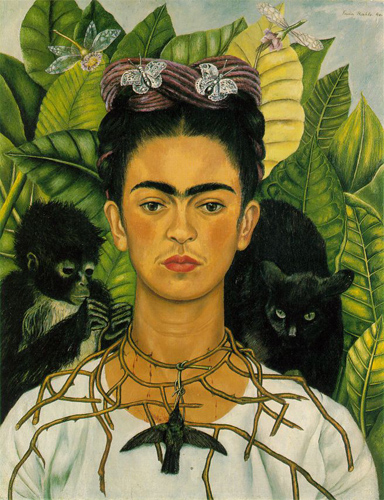
I decided to research the artist Frida Kahlo, as I found her self portrait very interesting and very neat. It has some characteristics that makes it look like Frida, such as the eyebrows and possibly her mouth, which looks the same as on the image below. Her expression is also the same on many of her paintings, and is what signifies her.

She uses a lot of traditional and cultural features in her paintings, which is what I definitely want for my painting, as my culture and tradition means a lot to me. She also painted mostly painted Mexican art and culture, realism, symbolism and surrealism.

On this painting, she has carefully painted all the details of what represents her, such as the leaves, stick jewelry around her neck and the animals - all symbols of nature. I have noticed that she has a strong connection with leaves especially, as I have seen three other self portraits of her with leaves in the background.

She has used different green colours on the leaves, and she has included shading which makes the whole painting slightly realistic, but still we can see that it is a painting. Overall, it is very neat and is a fantastic self portrait, in my opinion.

What I like about it, is the way she has placed herself in the middle, with things that represents her, around and on her. That is something I would want for my own portrait, but not so much. I like it simple. Also how she has made the whole painting complete.

http://en.wikipedia.org/wiki/Frida_Kahlo
- Anisha


Sunday 2 September 2012

Almost finished with the sketch :)

I have now done most of what I wanted to do with my sketch, and I feel that I am ready to print it onto the other A3 canvas. The only thing left, is to adjust the mouth because it is a little close to the nose, and also it is very small. I have decided to have my face and body straight, instead of to the side, because I feel that it can be a lot better and neater if it is straight. What I can do, is to rotate the sketch so that it looks like the face and body is straight, and then transfer it onto that thing.
Here is the picture of my latest sketch:

Thursday 30 August 2012

Started drawing!

I have now started drawing my face, and I am actually finished with it. The only feature I need to redo, is the nose as I feel it is too big. Maybe I have a big nose already, so it is supposed to be like that. What I want to do next, hopefully before the next lesson, is to finish the drawing completely, by also adding the body, and the background so that I am able to transfer it onto the one I will paint. This is what I want the outcome to look like (or not completely like this, but the idea) :


And here is what my work is currently at. I think it actually looks a lot like me, Im surprised :)


Also, as Frida Kahlo did, I want to include some sort of necklace around my neck with a feature that describes me. Maybe an elephant, because I like elephants, or the Om sign as a part of my culture. If I have a necklace with the Om sign, I want to change the right half of the background to something else. Maybe I decide to make the whole background colourful and add small musical notes on it. This is something to decide afterwards.


- Anisha

Thursday 23 August 2012

Sketches

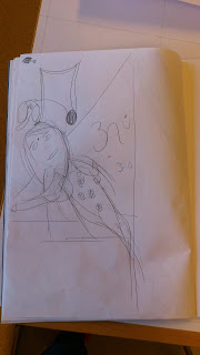
Here are some pictures of my sketches.. Not really neat, and some of them really ugly actually, but they are sketches after all:


- Anisha

Today's lesson

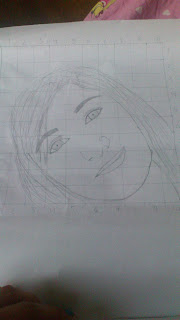
I have now done several sketches of how I want my painting to look like, and I have also finished doing the gridlines on my A3 paper. This below is the picture I decided to paint, but I have only put gridlines 1 cm squared accoss the face, as that is what I want to concentrate on. I can include the hair and possibly my body after a while.


Around my face I will paint the things that I like and what is really me, but that will be decided when the face is finished. As the painting Frida Kahlo painted of herself, I would like to include a necklace of something that I like, for eg. an elephant.


- Anisha

Thursday 16 August 2012

Symbolic Self Portrait - First Unit in Grade 10

Today, we started on a new unit called Symbolic Self-Portrait with the unit question: Who am I?
In this unit we have to create a painting of ourselves, expressing who we are, or how we see ourselves using symbols. This unit can be related to two earlier units; the "icon" unit, as we are trying to create an image of a real person, and the "key to painting" unit, as we will apply paint to our creation.
We started to look through artists and their symbolic self portraits to get some inspiration, as well as portraits from pervious students at IST. In addition to this, we started to write down ideas of our own painting.

Who am I?

I asked my classmates for ideas. What is really me? I made a list in my book and started to do sketches from this.
- Indian
- Singing
- Braid
- Flowery patterns (Always wear them)
- Big hair
- Nails
- Defining eyebrows
- Indian Goddess ( aww :D)
- Happy
- Elephant (I love elephants)

I have not yet found my final idea, but I would love to include things like elephant, flowery patterns and something with singing, as I know that this is me.

- Anisha

Thursday 3 May 2012

New Unit - Key to Painting

We have now started a new unit, called  Key to painting. In this unit, we are focussing on the aspects of painting - mixing cultures, what to apply first, warm and cool colours etc. We have recieved guiding points on how to create a successful drawings, as follows:
1. Big to Small
2. Thin to thick
3. Light to dark
4. Warm to cool.

We had to draw what was displayed on the table, first using pencil to outline the big contours of the overall picture. Afterwards, we started with the warm, light colours - mixing a lot of white and water - and filled the whole page with whatever chosen colour. Then today, we continued with this, as we followed on to mixing the real colours of the display and applying them onto our drawing.

I think my drawing is turning out to be very good, as I have applied warm colours to the drawing, creating a softness to it. That is what I want to achieve - to create a drawing which is soft and calming. The picture of my drawing will be coming later.

Monday 23 April 2012

Evaluation

My venetian mask is finished, and this is how it looks:

I think my masks looks good, even though it does not fit exactly on to my face. I was acutally going to create a star for the eye on the crazy side, the same as the shape of that side, but I changed my mind, something that I regret now since it could have created more effect. The purple colour is very dark, almost too dark because in the classroom it looked like I had used black, which is not something that I wanted. I could have used a different colour for this, although the other colours were okay.

When I asked my classmates what they thought was good, they said that it was very good, especially the use of colours which contrasts the hair. It was well made and proffesional, and they liked the way I presented my own personality into it. They thought that one side was a crazy side of me, and the other side was a happy side, even though the other side was supposed to represent me elegant. What I could improve on, was to make the elegant side bigger, because it is very thin, and also use a lighter colour to contrast the other side to create more effect.
I agree with all of what they said, both the good parts and the improvements, and I will take that into consideration for next unit, especially with the use of colours.

Wednesday 18 April 2012

Research - Designs & Material


Venetian masks are known by their intricate shape decorated with beautiful complex patterns in baroque style, which means that it uses easy interpreted details to produce drama, tension and other expressions.  Many different designs stem from Commedia dell’arte, known as a form of theatre which began in the 16th century in Italy.  The names of the different types of venetian masks often have own designs on them. These different types are:


Bauta – a mask which covers the whole face with no mouth, a V-shaped chin line and a lot of gliding.


Columbina – a half mask, only covering the eyes, often decorated with gold, silver, crystals, and feathers. It is usually held up by a special stick, called Baton, but can be tied with a ribbon around the head as well. 


Medico Della – a white long-beaked mask, with crystals covered around the round eye holes, creating an effect. This mask today is more decorative.


Moretta – has not been worn often since 1760. Is a round shaped mask, with round eye holes and a pointed nose, and is said to bring out the feminine features like women’s head, body and mind.


 Volto – is a mask, normally white, and also known as Larva, meaning ‘mask’ or ‘ghost’ in Latin. This is shown in the picture, as it is white with some decorations, and does look like a ghost.


 Therefore as we can see, there are different types of designs, which have their own size. It could either be an eye mask, like the Columbina, or a full face mask, like the Bauta. Usually in venetian masks, bright colours are often used such as gold and silver. White is also a colour used for most cases. What I have noticed on these masks when it comes to patterns, especially the masks that have been decorated, is that they use many different. They could use everything, from curls and waves to decorative diamond-shaped tiles. 

Most of the Venetian masks, especially the Traditional, are made out of Papier Maché, which is exactly what we are using when doing our own mask. Paper, plaster, plastic and porcelain can also be used when creating it. It is easy and simple!

Source:

Thursday 12 April 2012

Almost finished

I got some ideas from my class on how I could improve the work I had already done, by putting orange dots on the crazy side to create more effect of what I would like to show. This is my work so far. I hope to improve it next lesson, which is the last lesson we have.

Thursday 29 March 2012

Finished Colouring

Now I have finished colouring my mask purple. I managed to spill some white paint on the side, so when I tried to remove it, it wouldn't work and the paint was blurred out. This is something I will have to fix for next time. I also had a new idea of gluing red-painted small matchsticks on the mask's edge. I managed to paint the matchsticks so I have to glue them after the vacation

Sunday 25 March 2012

Finished with cutting!

The previous lesson I finished cutting the mask from the papier maché into the shape that I had designed. The pictures you can see on this website is not actually the real ones, because I didn't take pictures when I was finished with everything. Now I can start painting next week, and probably find something that would look good as 3D.


Thursday 15 March 2012

Started Creating!

Now I have started creating my mask. I first took some chicken wire, and place it on my face to form the shape of the mask appropriately. Then I used the rest of the double lesson to put several layers of papier maché (newspapers) on top of the mask with glue. I was able to finish it, so next week I am ready to start cutting and painting it to start to create the actual mask!

Research - Purpose

After the Catholic Church banned wearing the venetian masks masks, especially on holy days, it was reintroduced and eventually became a week-long celebration called ‘Carnevale’. Carnevale today is full of celebrations and is fun for everyone, tourists as well. The last time a Carnival happened in Venice, was from February 11 – February 21 2012. It is usually around this time each year.   Not only is the Carnival in Venice a fancy dress purpose for wearing these Venetian masks, it is also worn in high school prom or other, and for secret social rituals. It is used to cover up and hide the user’s identity and to charm and intrigue viewers. It is used for cheerful purposes.  

 Source: http://www.visitvenice.co.uk/venice-carnival/

http://www.ehow.com/about_5167261_information-venetian-masks.html

Thursday 8 March 2012

Designing!

Today I started on my design. What we had to do was to create designs, then eventually make them, that had some aspects of venetian masks' culture, and some aspects of our own personality or somethign that we would want to say. I had a number of different designs which I made in my sketchbook, but only some of them had features of something I would want to say to the world, or my own personality into it. We had to create something unique!
These are the designs which I first started with. As you may see, I had difficulties with imagining a unique style, so therefore chose to do similar features as in other traditinal Venetian masks, or the Columbina masks as they call it.


This is my final design which I would like to create. It shows off my personality, that I can be bothv crazy and elegant-looking, which is what I am trying to aim for, or to say to other people. By doing to different shapes on the same mask, would hide my face and let me be whoever I would like to be - giving options. The colours I have used show my favourite colour - purple - and the colour which is mostly used in Venetian Masks - gold. Black is also one colour which I will use on the edge of the mask. I am really looking forward to creating this, even though I am a little worried on how I can create the shape of the eyebrow on the elegant-looking side because I am not confident in using papier mache. On the opposite side I am not too worried about the shape because it is supposed to be all crazy.