I will now do an evaluation of my painting, discussing what was good, how it is linked to Frida Kahlo's technique or style, and what I can improve for next time.

What was good?
What I think was good, was how I used different symbols in my painting to represent my interests, my religion and my culture. The blue to purple shading, represents my favourite colour - purple. I think I managed to do this quite well, after demonstrations from the teacher. The "Om" signs on the other half of the background represents my religion - Hinduism. A beautiful, soft colour, with many signs on top. And the "bindi" (red dot on the forehead), and my traditional dress represents my culture - India. I have also added other symbols to the painting, such as the heart necklace (it is easy to understand what that is for) and my use of make-up, as I like to wear make-up and dress beautifully. I believe with these symbols, I am able to fully represent me, even though the image of me doesn't look the same.
Even so, there are some aspects of the painting that I like, such as my eyebrows that really defines my own eyebrows, and typical Indian ones. I also like the colours which I chose for my traditional dress (sari).
How was it linked to Frida Kahlo's paintings?
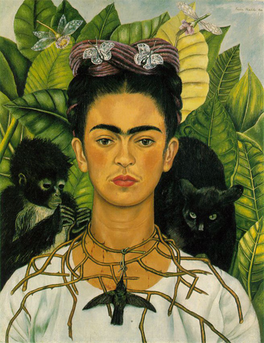
Similarly to Frida Kahlo's painting, I have placed myself in the middle of the canvas, as most other self-portraits. Frida Kahlo applies a lot of her culture and religion in her paintings, which is also something I did for my own. This is not present in this painting, although the painting below, shows a traditional dress, probably Mexican that defines her culture. Even so, what I have I have chosen to apply in my own painting from this one to the right, are the many symbols that is surrounding her body. Mine is simpler, but still includes many symbols of various aspects of myself. In addition, Frida Kahlo has chosen to make a necklace out of sticks in this picture, maybe to show that she is connected to nature (as seen with the leaves and animals in the background as well). For my painting, I used a simple heart to show something that represents me.
She as well, used many shades of green in the background, which can be connected to the shades of purple in my own painting.

What can I improve for next time?
I myself am not very pleased with the outcome of my painting, and when I asked others what they thought of it, I mostly received answers on how to improve it - not what was good. It does not look like me, especially concerning the outline of my face , nose and mouth, in addition to the hair. My face was a little too oval shape, and realistically my face is more round. My nose became too big, and so did my mouth. My hair was too thin at the top, compared to the bottom. I think my main reason for why it was not successful, was that I did not use my real photograph when applying the shading, and also when I was to trace the photo first in the grids on a A3 sheet of paper, I changed my mind to have it up-right instead of slanted, and changed my hair as well. This lead to me thinking about how it looked instead of seeing it right in front of me on the piece of paper. I think I should have taken another one, and followed it through. Even so, the hardest part was to transfer the outlines on the paper onto the canvas, and because I had to lift my paper each time I made a line to check if it was good, I might have moved the paper so that the new line was not according the the other one. This is an aspect to improve.
Also, my skin-colour was different for each lesson, as I had difficulties to mix either the same colour, or a better skin-colour. I did not always remember what colours I had used, and therefore ended up using at least half hour to mix this colour each lesson. Mixing colours is another aspect I will have to improve for next time.
I should also work on my shading, and use my photograph to do it.
- Anisha
What was good?
What I think was good, was how I used different symbols in my painting to represent my interests, my religion and my culture. The blue to purple shading, represents my favourite colour - purple. I think I managed to do this quite well, after demonstrations from the teacher. The "Om" signs on the other half of the background represents my religion - Hinduism. A beautiful, soft colour, with many signs on top. And the "bindi" (red dot on the forehead), and my traditional dress represents my culture - India. I have also added other symbols to the painting, such as the heart necklace (it is easy to understand what that is for) and my use of make-up, as I like to wear make-up and dress beautifully. I believe with these symbols, I am able to fully represent me, even though the image of me doesn't look the same.
Even so, there are some aspects of the painting that I like, such as my eyebrows that really defines my own eyebrows, and typical Indian ones. I also like the colours which I chose for my traditional dress (sari).
How was it linked to Frida Kahlo's paintings?
Similarly to Frida Kahlo's painting, I have placed myself in the middle of the canvas, as most other self-portraits. Frida Kahlo applies a lot of her culture and religion in her paintings, which is also something I did for my own. This is not present in this painting, although the painting below, shows a traditional dress, probably Mexican that defines her culture. Even so, what I have I have chosen to apply in my own painting from this one to the right, are the many symbols that is surrounding her body. Mine is simpler, but still includes many symbols of various aspects of myself. In addition, Frida Kahlo has chosen to make a necklace out of sticks in this picture, maybe to show that she is connected to nature (as seen with the leaves and animals in the background as well). For my painting, I used a simple heart to show something that represents me.
She as well, used many shades of green in the background, which can be connected to the shades of purple in my own painting.
What can I improve for next time?
I myself am not very pleased with the outcome of my painting, and when I asked others what they thought of it, I mostly received answers on how to improve it - not what was good. It does not look like me, especially concerning the outline of my face , nose and mouth, in addition to the hair. My face was a little too oval shape, and realistically my face is more round. My nose became too big, and so did my mouth. My hair was too thin at the top, compared to the bottom. I think my main reason for why it was not successful, was that I did not use my real photograph when applying the shading, and also when I was to trace the photo first in the grids on a A3 sheet of paper, I changed my mind to have it up-right instead of slanted, and changed my hair as well. This lead to me thinking about how it looked instead of seeing it right in front of me on the piece of paper. I think I should have taken another one, and followed it through. Even so, the hardest part was to transfer the outlines on the paper onto the canvas, and because I had to lift my paper each time I made a line to check if it was good, I might have moved the paper so that the new line was not according the the other one. This is an aspect to improve.
Also, my skin-colour was different for each lesson, as I had difficulties to mix either the same colour, or a better skin-colour. I did not always remember what colours I had used, and therefore ended up using at least half hour to mix this colour each lesson. Mixing colours is another aspect I will have to improve for next time.
I should also work on my shading, and use my photograph to do it.
- Anisha
No comments:
Post a Comment