Thursday 8 December 2011

Evaluation of both paintings!

Here is an evaluation of the cubist paintings/drawings I drew, and how I think of the unit.
The first drawing was an analytical cubsism:
In this picture I chose to focus mostly on the guitar, and drawing other details in afterwards as that is what I preferred to do. Even though I focused on the guitar, I chose to draw the manequin in the middle, so that when people first look at the picture, they firstly see the model, and then see several aspects and contours of the guitar. I think that the drawing was okay. I feel that something is missing in it, and i think that it is the shading. The shading could have been better to get the draw complete. This is something that I need to work more on.


The second drawing was a synthetic cubist painting:
For this painting we could choose what we wanted to draw or paint and so therefore I wanted to draw something that was close to me. My religion. The painting includes Ganesh, one of our gods, the 'Om' symbol and the swastika symbol. 

When I was finished with drawing it, with different views, I started to paint it. I wanted to have some sort of effect that will strengthen the painting and that was to paint it very dark at one place and get it lighter and lighter as they go along. Like the hand, the right side is much darker than the left side and this can create some sort of shading. I hadn't managed to complete it without help from Marta, Seyia and AJ.
I also chose to use three main colours that complement each other to create more of an effect as well. The piece of brown paper at the bottom is not supposed to be there actually, as I thought of using complementary colours after I had glued it on. The swastika symbol was also not in the same colour, so it stands out but that doesn't matter. 

I actually didn't want to include the swastika symbol at first because for me it means peace, strength and good luck, but for most of others, it means hate and death. I didn't want to explain myself to others as to why I chose to draw it, but when I finished with everything I thought about it and then I came to an conclusion that if the symbol actually means something to me and my religion then other people shouldn't stop me. Therefore I also chose to write a text, which will be placed beside my painting, about what the swastika symbol means for other cultures for some people, and what it means to other people. This will make people understand more and will give international awareness to the students and teachers. 
Overall I think the painting was successful!

The unit was also very good. I didn't understand it fully at first, but after some practice, I was able to understand :-)
- Anisha

Friday 25 November 2011

Progress 24.11

Today I finished my first cubist drawing, and started off with the second drawing, I wanted to have something about my culture or religion, so I chose the Om symbol and Ganesh, one of the gods from India.

The first cubist drawing I think was okay, but I think I will do it better with my next drawing, even though I only have a double-lesson left for my next one. I have already started to draw it on a piece of paper. I just need to finish that, then trace it onto grey paper, and then shade it. Hopefully I will be able to do all this next time, if I work really hard!

As soon as Mr Roman puts out the picture of my finished work, I will display it here. :-)

Tuesday 15 November 2011

Before & After pictures

This is my picture before & after the lesson


I regret using yellow on the stripes, so i am going to try to take it away, but other than that I am happy!

Thursday 10 November 2011

My Cubist Drawing

Last time, we drew another drawing using the same display, the guitar, flowers, etc. I think this was the most successful drawing so I chose it for my asssignment. After choosing the most successful drawing, we all had to draw the same drawing on a thicker, darker piece of paper, my placing the white paper on the thick paper, and draw the same contours again.
That is how far I have come right now.


Later today I will be writing about what I did in today's lesson, and the drawings before and after the lesson, as I don't have the picture right now.
- Anisha

Tuesday 1 November 2011

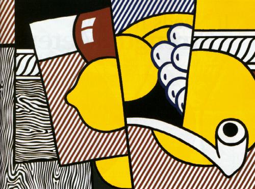
Cubist Still Life by Roy Lichtenstein

I have chosen to discuss the cubist drawing 'Cubist Still Life' by Roy Lichtenstein.
This Cubist Painting was made in 1974, and was one of Roy Lichtenstein's many cubist paintings.I like it because we are able to imagine what it shows, and because it is a very simple cubist painting, very like the ones we are going to make for the assignment. I think it shows parts of a table, some white grapes, a brown pot?, a smoking pipe.

It is made form manyview points, and is very similar to what we have done in the lesson, like when we split the page into different parts and started to draw from different angles. What I can learn from this picture when doing my own cubist painting, is the use of colour and stripes. The artist has used colours that stand out and used stripes which help the pcture become successful. I of course do not have to do that, but it is and idea.

I also like the way the artist has made the objects in the picture so big, and split it into different parts, which is something I can do in my own drawing.

Unit 2 - Cubism

We have started a new unit called cubism.
Cubism is all about different view points, aspects and angles.
Today we first started off with drawing a guitar, a box, a flowerpot with 2 roses, and some more which was displayed in front of the classroom.
We had to draw the same display in a different viewpoint or angle on the same sheet of paper, making the drawing look abstract.  To help us, we made two or three lines all across the sheet of paper and drew only some parts of the diplay in our area, and the other part with a different angle on the next area etc.
I think it was a little difficult, but with pr:actice makes perfect.
This is my drawing of today's lesson:


- Anisha

Sunday 2 October 2011

Design Cycle

So here is my evaluation of my work I have done in the class.
Investigate:
So firstly I had to figure out who to draw. I was told that it had to be a face of an icon, since that is what our current unit was. I did not have much problems with this, because I wanted to draw Sharukh Khan straight away. so I chose a picture of him. I knew from before that the hair would be hard to draw, but I took a risk. Overall it looked like a fairly simple picture to draw, I thought.

Plan:
Before I came to the create section, I started to plan how I was going to do it by drawing lines of one cm horizontally and vertically, on a printed picture of Sharukh Khan and examining the details in each box of it. This I did with a black pen, and then with a red pen I drew lines of two cms on top of the other ones so I got a bigger box to work with. I did this because then I did not have to focus too much on the details in some of the boxes as there were not very much details in it. I relieased that the hair would be difficult to draw, and because it was so dark, I had to make extra thick red lines on top of it.

Create:
I started with taking an A3 sheet of paper and drawing the same helping lines as in the pinted picture.
I started of with constructing the shape of the face, before I put small details in. For example the location of the eyes, mouth and nose, and the size of the hair. What I had most difficulties with was the hair, because I didn't use the picture with the helping lines to help me. I just drew what I thought I saw, not what I actually did. I got very frustrated then and jsut scribbled through everything, but the next time we had lesson I erased all the hair out and started knew making it what I think is the best part of the whole drawing. I then finished with the eyes, mouth and nose after some descent care, following the other picture and using the helping lines. I also did the throat and a little bit of his shirt. I then started to shade out. At first I did not know how to use the grey scale, so I just shaded what I thought was appropriate. I then got help, and was told that I should draw with the eraser, so it would be better. I did this and it was much better! I then smudged it with my finger and it was done.

Evaluation
I think my drawing is really good, and I am proud of myself of what I have accomplished. What I am most proud of is the hair because it really does follow his real hair on the 'guiding picture'. I like that I managed to use the greyscale to have some grey, some black and some white lines on the hair to make it realistic. What I could improve was the eyes because I think the eyes were really small and narrow compared to the real picture. I also think the mouth was a little to the side. Generally I am very pleased with the picture!

Monday 26 September 2011

22.09.2011

Today I was finished with my drawing and I am very pleased with what I have made. I started of with the entire face shaded so I wanted to rub it all out. Instead Mr Roman told me to 'draw with the eraser' meaning that I should rub out the white parts and other parts if neccessary using the grey scale. I did this, and after some time I managed to finish my picture.
This is how the drawing was in the beginning of the lesson, and after it. Very much difference!


Rate for this lesson: 9 :)
Anisha Sharma

Wednesday 21 September 2011

15.09.2011

Today I remade the face. I made the eyes more realistic, and I am quite happy with that, but the mouth and nose I was a little unstatisfied with. I first of all, rubbed all the "dirt" of the sheet of paper and started new. I had made the nose, eyes and mouth, and I then started with the shirt, which was totally white. I then had to shade his skin which I had a little trouble understanding it, because I started to shade the whole face, when I only needed to shade some part.I think I have got it know so I will be able to do it next lesson, I hope. The picture under is taken in the middle of the class.


Rate for this lesson: 6

Thursday 15 September 2011

08.09.2011

Last lesson I worked on my picture, and since i was frustrated in the beginning, I planned rub out the hair completely, and planned to start over, but instead I only rubbed out some of it, and drew what I saw, not what I think I saw. I tried to do it as accurately as possible, and I think I did very well. The pictures under show the differene between in the beginning of the lesson and the end of the lesson. I am quite satisfied with the hair that I have drawn.

The focus for next lesson is to make the face accurate.
Rate for this lesson out of 10 : 9 :)

Thursday 1 September 2011

Frustration!

Today in the art lesson, I started drawing the hair. It was super difficult to draw it. Mr Roman said that I should draw the basic lines of the hair first, and then shade it. But I am seriously not good at copying and drawing from a sheet of paper, even not with the helping lines. I was so frustrated to i just scribbled the hair on. I am still frustrated because I am still in the lesson. The hair is such a mess, and the sheet of paper is really dirty. Will I be able to do it? Maybe not right now. But if I come with a clear mind next time, maybe? 

Rate for this lesson (out of 10): 3
 Anisha Sharma

Last lesson!

I forgot to blog last week, so I am doing it today. Last week i started to work on the face. The outline of the face was okay, but I got a problem with the mouth, nose and eyes. The eyebrows was also difficult to draw, but I think i drew them okay. :)

Wednesday 24 August 2011

Unit 1 - Icon

The first unit of the year, is called Icon. We will have to draw a picture of a celebrity of our own choice, with the help of graph paper. I have chosen an indian actress called Shahrukh Khan, and I will be drawing him.
Last lesson I took an A3 piece of paper, and made lines like in a graph paper, which had 4 cm lenght and 4 cm breadth. I then printed out the picture of him, and made lines on the picture itself, with 1 cm lenght and 1 cm beadth. This will then help me when I come to draw him on the A3 sheet of paper. 


Anisha Sharma

Sunday 21 August 2011

About this blog

 My name is Anisha and I am a Grade 9 student at International School of Telemark ( IST ). I have made this blog for myself, and also for my art teacher, Roman Scott. My goal for this blog is to make a record of everything I do in the Art lessons, including pictures of my drawings/designs, our tasks, and I will also mention the Design Cycle. 
I am not saying that I am very good at drawing, but I know myself that I try my best, if it something I am really excited about.

 Anisha Sharma